The foundations of pre-20th-century color theory were built around "pure" or ideal colors, characterized by sensory experiences rather than attributes of the physical world. This has led to a number of inaccuracies in traditional color theory principles that are not always remedied in modern formulations.
The most important problem has been a confusion between the behavior of light mixtures, called additive colour, and the behavior of paint or ink or dye or pigment mixtures, called subtractive colour. This problem arises because the absorption of light by material substances follows different rules from the perception of light by the eye.
A second problem has been the failure to describe the very important effects of strong luminance (lightness) contrasts in the appearance of colors reflected from a surface (such as paints or inks) as opposed to colors of light; "colors" such as browns or ochres cannot appear in mixtures of light. Thus, a strong lightness contrast between a mid-valued yellow paint and a surrounding bright white makes the yellow appear to be green or brown, while a strong brightness contrast between a rainbow and the surrounding sky makes the yellow in a rainbow appear to be a fainter yellow, or white.
A third problem has been the tendency to describe color effects holistically or categorically, for example as a contrast between "yellow" and "blue" conceived as generic colors, when most color effects are due to contrasts on three relative attributes that define all colors:
- lightness (light vs. dark, or white vs. black),
- saturation (intense vs. dull), and
- hue (e.g., red, orange, yellow, green, blue or purple).
Thus, the visual impact of "yellow" vs. "blue" hues in visual design depends on the relative lightness and intensity of the hues.
http://www.wikipedia.org/
colour mixing screens:
There are also definitions (or categories) of colors based on the color wheel. We begin with a 3-part color wheel.
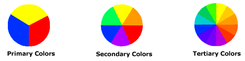
Primary Colors: Red, yellow and blue
In traditional color theory (used in paint and pigments), primary colors are the 3 pigment colors that can not be mixed or formed by any combination of other colors. All other colors are derived from these 3 hues.
In traditional color theory (used in paint and pigments), primary colors are the 3 pigment colors that can not be mixed or formed by any combination of other colors. All other colors are derived from these 3 hues.
Secondary Colors: Green, orange and purple
These are the colors formed by mixing the primary colors.
Tertiary Colors: Yellow-orange, red-orange, red-purple, blue-purple, blue-green & yellow-green
These are the colors formed by mixing a primary and a secondary color. That's why the hue is a two word name, such as blue-green, red-violet, and yellow-orange.
http://www.colormatters.com/color-and-design/basic-color-theory
No comments:
Post a Comment